Blueprint
Black drafting table, dashed frames, mono labels and one periwinkle pen. Every section reads like a drawing.
- Dark by default
- 35 colours · 14 type steps
- Inspired by index.app
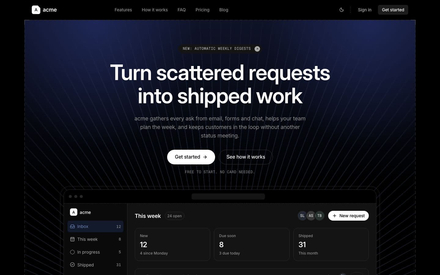
The same generated app in every design. Scroll inside the window to see the whole page.
What it is
Blueprint draws every landing section as a sheet pinned to a black table: a 1px dashed frame at the content column, stacked 6px apart, with a solid tick at each corner. The hero sits under a navy lamp, with fine periwinkle rays running to a vanishing point. Headlines are a tight grotesk at weight 600, labels are mono capitals, and every action is a pill. The palette is almost all grey, and one periwinkle pen marks icons, ticks, links and focus. There are no drop shadows: depth is a step from void to carbon and a dashed line.
Maintained by @agentic-studio in the open registry.
Best for
Developer tools, data and analytics products, infrastructure and AI platforms that want to feel exact and calm. Teams whose product is dark, dense and technical, and who want the page to read like a spec sheet.
Trade-offs
- Pure black with dashed frames is cold on purpose. Warm consumer products and playful brands will feel out of place in it.
- Colour is rationed to one periwinkle and muted status tones. A brand that needs a loud colour, or a coloured section band, will fight the palette.
- The frames, rays and lamp are CSS gradients on landing hooks. They repeat on every section, so a page with many short sections gets busy, and a section without the hook gets no frame.
Tokens
Generated from this design’s design.yaml, and shipped as CSS variables plus a Tailwind theme. Templates may use these names and nothing else.
Colours
Every colour token in design.yaml, grouped the way the system documents them. These are the dark palette's values. The light palette uses the same names with its own values, and tokens.css ships both.
Brand and accent
accent
#7089ba
accent-1
#7089ba
accent-2
#d4d4d4
accent-3
#7db2a1
accent-4
#e8b65e
accent-5
#b24f58
accent-6
#7d52a3
accent-hover
#8ba0cc
accent-soft
#121a2c
primary
#ffffff
Surface
canvas
#000000
hairline
#2a2a2a
surface-card
#141414
surface-dark
#0a0a0a
surface-dark-elevated
#1c1c1c
surface-soft
#0a0a0a
surface-solid
#121212
surface-strong
#242424
Text
body
#ababab
body-strong
#e0e0e0
ink
#ffffff
muted
#8f8f8f
muted-soft
#666666
on-accent
#000000
on-dark
#ffffff
on-primary
#000000
Semantic
error
#e5847b
success
#7fc0a0
warning
#d9b46a
Other
danger
#e5847b
danger-soft
#221211
error-soft
#221211
primary-hover
#d9d9d9
success-soft
#0f1d17
warning-soft
#1f1a0e
Type scale
Each token rendered at its real size, weight, line height and tracking. Specimens fall back to this site's typeface when the design's own face is not installed locally, so read the numbers, not the letterforms.
Ship faster
- Token
- display-xl
- Values
- 4.375rem · 70px · 600 · lh 1.08 · ls -0.02em
Ship faster
- Token
- display-lg
- Values
- 3.5rem · 56px · 600 · lh 1.1 · ls -0.02em
Ship faster
- Token
- display-md
- Values
- 2.5rem · 40px · 600 · lh 1.12 · ls -0.02em
Ship faster
- Token
- display-sm
- Values
- 2rem · 32px · 600 · lh 1.2 · ls -0.015em
Ship faster
- Token
- title-lg
- Values
- 1.5rem · 24px · 600 · lh 1.3 · ls -0.015em
Ship faster
- Token
- body-lg
- Values
- 1.125rem · 18px · 400 · lh 1.55 · ls -0.01em
Ship faster
- Token
- title-md
- Values
- 1.125rem · 18px · 600 · lh 1.4 · ls -0.01em
Ship faster
- Token
- body-md
- Values
- 1rem · 16px · 400 · lh 1.6 · ls -0.01em
Ship faster
- Token
- title-sm
- Values
- 1rem · 16px · 600 · lh 1.4 · ls -0.01em
Ship faster
- Token
- body-sm
- Values
- 0.875rem · 14px · 400 · lh 1.55 · ls -0.005em
Ship faster
- Token
- button
- Values
- 0.875rem · 14px · 500 · lh 1 · ls -0.01em
Ship faster
- Token
- nav-link
- Values
- 0.875rem · 14px · 500 · lh 1.4 · ls -0.01em
Ship faster
- Token
- caption
- Values
- 0.75rem · 12px · 500 · lh 1.45 · ls 0
SHIP FASTER
- Token
- caption-uppercase
- Values
- 0.75rem · 12px · 500 · lh 1.4 · ls 0.06em
Typefaces
The families the generated Tailwind theme points at. A licensed face is named here even when the substitute below is what actually renders.
- DisplayInter, ui-sans-serif, system-ui, sans-serif
- BodyInter, ui-sans-serif, system-ui, sans-serif
- MonoGeist Mono, ui-monospace, SFMono-Regular, Menlo, monospace
Spacing scale
Drawn at true size. These are the only gaps and paddings a generated repo is allowed to use.
- xxs0.25rem · 4px
- xs0.5rem · 8px
- sm0.75rem · 12px
- md1rem · 16px
- lg1.5rem · 24px
- xl2rem · 32px
- xxl3rem · 48px
- section5rem · 80px
Radius scale
Sample shapes at true corner radius. Buttons and inputs sit at the small end of this scale, feature cards at the large end.
- xs0.25rem · 4px
- sm0.375rem · 6px
- md0.5rem · 8px
- lg0.875rem · 14px
- xl1.25rem · 20px
- full9999px
- pill9999px
Elevation
Shadow tokens on a neutral card, at true blur and spread.
- inset0 0 #0000
- lift0 0 #0000
- overlay0 24px 64px -16px rgb(0 0 0 / 0.9)
- ring0 0 0 3px rgb(112 137 186 / 0.35)
- soft0 0 #0000
- xs0 0 #0000
DESIGN.md
Ships in your repo as DESIGN.md. The designer agent reads it before it may introduce a new visual pattern. This is the briefing, not a page about the briefing.
Blueprint is a dark design that reads like a set of technical drawings on a black drafting table. Every landing section is a square dashed sheet with ticked corners, and the hero and the closing sheet sit under a navy lamp with fine periwinkle rays. Labels are mono capitals, numbered like drawing sheets. Light mode is the same sheet printed on white paper.
Read this before you add a screen, a component or a colour. The tokens live in
src/app/globals.css, the faces in src/app/fonts.ts, the kit in
src/components/ui/.
At a glance
| Theme | Dark first: a pure black canvas with grey steps up to #242424. Light is pure white with the same structure. |
| Type | Inter 600 with tight tracking for headlines, Inter 400 and 500 for text, Geist Mono capitals for labels. |
| Colour | Almost all grey. One periwinkle pen for icons, checks, links, focus and chart series 1. Muted status tones. |
| Shape | Frames are square, objects are round: pill buttons, badges and tabs, 8px inputs, 14px cards, 20px dialogs. |
| Depth | No drop shadows. Depth is a surface step and a dashed line. Only floating panels get a shadow. |
| Signature | Dashed sheet frames with corner ticks, numbered mono eyebrows, a navy lamp with rays, CAD grid pictures. |
Principles
- Every landing section is a square dashed sheet at the content column.
- Solid lines for things you touch, dashed lines for things that frame.
- One periwinkle pen. Everything else is grey.
- Every action is a pill. Frames never round.
- Flat by rule: depth comes from a surface step, not a shadow.
Colour
Palette
| Token | Light | Dark | Role |
|---|---|---|---|
canvas (--background) | #ffffff | #000000 | The page floor |
surface-soft | #fafafa | #0a0a0a | Section bands, sidebars, table heads |
surface-card (--muted) | #f4f4f4 | #141414 | Tinted fills: inactive tabs, hover rows, code |
surface-strong | #e8e8e8 | #242424 | Pressed fills, progress tracks |
surface-solid (--popover) | #ffffff | #121212 | Menus, selects, toasts: always opaque |
card | #ffffff | #0a0a0a | The card fill |
surface-dark | #000000 | #0a0a0a | The inverted panel |
hairline (--border) | #e4e4e4 | #2a2a2a | Every border and divider |
ink (--foreground) | #000000 | #ffffff | Headings and primary text |
body-strong | #1c1c1c | #e0e0e0 | Emphasised body text |
body | #4d4d4d | #ababab | Running text |
muted (--muted-foreground) | #6b6b6b | #8f8f8f | Secondary text, captions |
muted-soft | #8f8f8f | #666666 | Placeholders, disabled text, icons at rest |
primary | #000000 | #ffffff | The action colour |
accent (--accent-fill) | #506aa3 | #7089ba | The saturated accent: links, the accent badge |
accent-soft | #edf0f7 | #121a2c | The tint an accent label sits on |
danger (--destructive) | #b0443c | #e5847b | Destructive actions and errors |
success, warning and error each come with a -soft tint for the back of a
badge or an alert: #2c7254, #88621a and #b0443c in light, #7fc0a0, #d9b46a and
#e5847b in dark.
Blueprint's own variables, read by the landing hooks and the kit: --dash
(#c8c8c8 light, #333333 dark), --glow-1 (rgb(112 137 186 / 0.24) light,
rgb(36 48 104 / 0.7) dark), --glow-2 (rgb(112 137 186 / 0.1) light,
rgb(30 38 80 / 0.5) dark), --ray (rgb(80 106 163 / 0.16) light, rgb(112
137 186 / 0.2) dark), --grid-line (rgb(80 106 163 / 0.1) light, rgb(112
137 186 / 0.1) dark), --stipple (rgb(0 0 0 / 0.3) light, rgb(255 255 255 /
0.4) dark).
How colour is used
- The canvas is pure black in dark and pure white in light. Surfaces lift in small grey steps: #0a0a0a, #141414, #242424.
- Periwinkle marks icons, checks, radio dots, the switch track, links, focus rings, progress and sheet numbers. It never fills a button or a band.
- The navy lamp and the rays live only in the hero sheet and the closing sheet.
- Status colours are muted sage, amber and brick, each with a dark soft fill for badges and alerts.
- The primary button is the inverse of the canvas: a white pill on black, a black pill on white.
Charts
accent-1 to accent-6 (also chart-1 to chart-6) are six series colours
ordered so neighbours stay distinguishable. Six series in order: periwinkle,
paper grey (ink in light), sage teal, amber, brick and plum. Every pair stays
apart in normal vision and in red-green colour blindness. Assign them in order;
never let colour be the only way to tell two series apart.
Dark mode
The palette is declared twice in src/app/globals.css: light on :root, dark
under @media (prefers-color-scheme: dark) and again on .dark, where the
class wins in both directions. @theme inline points every utility at those
variables, so bg-canvas is one class that follows the mode.
src/lib/design.ts sets the theme a first visit opens in: dark here, because
Blueprint is drawn in dark first. The theme menu in the header offers light,
dark and system and remembers the choice.
Type
Faces
- Inter (
font-display,font-body): headings and display type; running text and interface copy. - Geist Mono (
font-mono): code, ids and tabular labels.
Inter's optical size axis gives a tight, blocky display cut at 32px and up and an open text cut at body sizes, so one family carries headlines and copy. Geist Mono sets every eyebrow, tag, table head and code sample in drafting capitals.
Every face loads through next/font/google in src/app/fonts.ts: downloaded at
build time and served from this app. Change a face there and here, together.
Scale
| Token | Size | Line | Tracking | Weight | Use |
|---|---|---|---|---|---|
text-display-xl | 70px | 1.08 | -0.02em | 600 | The hero headline, desktop |
text-display-lg | 56px | 1.1 | -0.02em | 600 | The hero headline, tablet |
text-display-md | 40px | 1.12 | -0.02em | 600 | Section headlines, the hero on phones |
text-display-sm | 32px | 1.2 | -0.015em | 600 | Section headlines on phones, big numbers |
text-title-lg | 24px | 1.3 | -0.015em | 600 | Page titles in the app |
text-title-md | 18px | 1.4 | -0.01em | 600 | Card titles |
text-title-sm | 16px | 1.4 | -0.01em | 600 | Small headings, table titles |
text-body-lg | 18px | 1.55 | -0.01em | 400 | Lead paragraphs |
text-body-md | 16px | 1.6 | -0.01em | 400 | Running text |
text-body-sm | 14px | 1.55 | -0.005em | 400 | Interface copy, table cells |
text-caption | 12px | 1.45 | 0 | 500 | Metadata, helper text |
text-caption-uppercase | 12px | 1.4 | 0.06em | 500 | Eyebrows above headings |
text-button | 14px | 1 | -0.01em | 500 | Buttons |
text-nav-link | 14px | 1.4 | -0.01em | 500 | Header and footer links |
Rules: one h1 per page. Display sizes are for marketing pages; the app tops
out at text-title-lg. Display and titles are Inter 600 with -0.02em to -0.01em
tracking, never lighter and never looser. Eyebrows, uppercase badges, line tabs,
table heads, menu labels and shortcuts, avatar initials, pagination numbers, kbd
and code are Geist Mono. Buttons and nav stay in Inter 500, and stats use Inter
with tabular figures.
Space and layout
- Spacing tokens:
xxs4px,xs8px,sm12px,md16px,lg24px,xl32px,xxl48px,section80px (the gap between landing sections). - Content sits in
max-w-content(1280px) withpx-mdon phones andpx-lgfromsmup. Reading text stops atmax-w-measure(672px). - Compact inside components: 10px gaps, 24px card padding, 40px controls.
- Generous between sections: 80px section padding, with sheet frames stacked 6px apart.
- Centre only the hero, section headings and short calls to action. Body text runs left.
Shape and depth
| Token | Value | Where |
|---|---|---|
rounded-xs | 4px | Breadcrumb, Checkbox, Kbd |
rounded-sm | 6px | Accordion, Tabs, Tooltip, the landing page |
rounded-md | 8px | DropdownMenu, Input, Select, Skeleton, the landing page |
rounded-lg | 14px | Alert, Card, DropdownMenu, Popover, Select, Toaster, the landing page |
rounded-xl | 20px | AlertDialog, Dialog, the landing page |
rounded-pill | 9999px | Badge, Button, Dialog, Progress, Sheet, Switch, Tabs, Toaster, the landing page |
rounded-full | 9999px | Avatar, RadioGroup, Switch |
Section frames, the hero sheet, the closing sheet and the stat grid are square. Inputs round at 8px, cards at 14px, dialogs and pictures at 20px, and every button, badge and default tab is a pill. Borders are 1px: solid on controls and floating panels, dashed on frames and rules. Only menus, dialogs, sheets, toasts and select content carry the overlay shadow.
Components
Every component lives in src/components/ui/ and is written against the tokens
above. Import from there; never restyle a kit component inline to make a
one-off.
| Component | In Blueprint |
|---|---|
Button | Every variant is a pill in Inter 500 with a 1px border slot and no shadow. Primary is the inverse of the canvas, secondary is a carbon pill with a hairline, outline is a grey line that firms up on hover, ghost is text that gains a faint fill on hover, danger is brick, link is periwinkle. Buttons press down 1px, and focus is a periwinkle ring with a canvas gap. |
Badge | A pill with a 1px solid border at 12px 500. Neutral is carbon with a hairline, accent is a navy soft fill with periwinkle text, status badges use their soft fill and a faint status border. Uppercase mode turns any badge into a drafting tag: mono capitals, a dashed border and no fill. |
Card | 14px corners and no shadow. Default is carbon with a hairline, soft has a dashed hairline on the soft fill, strong is one grey step up with no border, outline is a dashed drawing frame, and dark keeps a faint light edge so it still reads on the black page. |
Input, Textarea, Select | 40px tall, 8px corners, a soft fill and a solid grey border that firms up on hover. Focus turns the border periwinkle with a soft halo, invalid turns it brick. A mono option for ids, hosts and versions. The select chevron turns ink while open, and its menu is a solid 14px panel with mono capital group labels and a periwinkle check. |
Checkbox, RadioGroup, Switch | Selection is drawn with the pen: a periwinkle check on a navy soft fill, a periwinkle ring and dot for the radio, a periwinkle switch track with a canvas coloured thumb. Off is a grey border on the soft fill, or a dark track with a grey thumb. No shadows. |
Tabs | Default is a carbon pill track with a hairline, the active pill on the canvas colour with no shadow. Line tabs are square mono capitals on a dashed baseline, the active one with a 1px solid ink rule. |
Accordion | Rows split by dashed rules. Questions are 16px titles that turn periwinkle on hover, and the chevron turns and goes periwinkle when open. Answers are 16px body text. |
Dialog, AlertDialog, Sheet | Dialogs are solid panels with a hairline, 20px corners and the overlay shadow, over a plain dark scrim with no blur. Titles are 24px, the footer sits on a dashed rule, and close is a round ghost button. Sheets are square with a hairline on the inner edge and a dashed rule under the header. |
DropdownMenu, Popover, Select content, Tooltip | Solid panels with a hairline, 14px corners and the overlay shadow. Items are 8px rounded rows that highlight one grey step up, group labels and shortcuts are mono, checks and radio dots are periwinkle, separators are solid. The tooltip is an inverted chip with no border. |
Table | No outer frame. Mono capital heads over a solid hairline, body rows split by dashed hairlines, tabular numbers, a faint fill on hover and a soft footer. |
Alert | 14px corners, a soft fill and a faint border in the status colour. Info uses the navy soft fill and a periwinkle icon. |
Avatar, Progress, Skeleton, Spinner, Separator, Kbd, Breadcrumb, Pagination, Field, Label, Toaster | Avatars are carbon circles with a hairline and mono initials. Progress is a periwinkle bar on a thin grey pill track, and spinners are periwinkle. Skeletons are a faint carbon block that stays still under reduced motion. Separators are dashed drafting rules. Kbd is mono with a heavier bottom edge. Breadcrumbs use a slash like a file path. Pagination numbers are mono pills, the current page outlined. Labels are 14px 500, field help is 12px grey, errors are brick, legends are 16px titles. Toasts are solid 14px panels with the overlay shadow and pill actions. |
The landing page
The landing page is the same in every design; the design decides how it looks.
Its sections carry data-slot hooks (listed at the top of
src/components/marketing/section-heading.tsx) that globals.css may style.
Blueprint styles these:
section: every section is a numbered sheet, a dashed frame at the content column with a solid tick at each corner, 6px from its neighbours. Soft sections fill their sheet with carbon, never colour.hero-backdrop: the hero sheet, framed and ticked, under two navy lamp glows and a top wash, with fine periwinkle rays fanning up from the bottom centre behind the product picture.hero-eyebrow: a carbon chip in mono capitals with no border at rest. Its arrow becomes a filled dot.hero-titleandsection-title: lines break evenly. Weight and tracking come from the type scale.hero-subtitle: grey and capped at 36rem.hero-note: mono capitals in grey.product-preview: no shadow and a dashed bounding box 10px out.product-preview-barturns black over a dashed rule. A real screenshot inhero-visualgets the same box.section-eyebrow: grey mono capitals with the sheet number in periwinkle, like 01 / FEATURES. Showcase rows count as details, like 02.1 / LABEL.logo: greyscale and slightly faded, full strength on hover. The strip title goes mono.feature-card: no box, the sheet holds the columns.feature-icon: a carbon circle with a periwinkle icon.showcase-visual: a carbon CAD sheet with a 24px periwinkle grid and white stipple.showcase-row: rows split by a dashed rule.step-marker: a carbon circle with a mono periwinkle number. The rule joining the steps is dashed.stat-grid: a square dashed schedule with cells split by dashed lines and tabular numbers.testimonial: a carbon tile with 20px corners and no border.faq: rows split by dashed rules.cta-bandandcta-panel: a second, shorter hero sheet, black in both themes, lined up with the section frames, with the lamp, the rays and ticked corners.site-header: pure black with no blur. The hairline fades in after 6rem of scroll, links sit centred with a periwinkle underline on the current page, and header buttons become 6px carbon keys.brand-mark: a small sheet with its top right corner cut.site-footer: the last sheet, dashed top and sides with ticked top corners, running off the page. Column titles are mono.
Everything else is type, space and the kit.
Signed-in screens
The dashboard is a drawing set: black canvas, a soft sidebar split by a solid hairline, carbon stat cards with mono labels and 32px tabular numbers, tables with mono heads and dashed row rules. Sign-in is one carbon card centred on the void, with 40px fields, a full-width primary pill, outline provider pills and a dashed separator with a mono OR.
Do and don't
Do
- Frame every landing section as a square dashed sheet at the content column, 6px from its neighbour.
- Keep the canvas pure black in dark and pure white in light. Lift surfaces in small grey steps.
- Set every eyebrow, tag and table head in Geist Mono capitals with 0.04em to 0.06em tracking.
- Use periwinkle only as the pen: icons, checks, radio dots, the switch track, links, focus, progress and chart series 1.
- Make every action a pill. The one exception is the 6px carbon keys in the marketing header.
- Keep one lamp: the navy glow and rays live in the hero and the closing sheet only.
- Use tabular numbers for stats, prices and table numbers.
- Put solid lines on things you touch and dashed lines on things that frame.
Don't
- Don't add drop shadows to cards, buttons or inputs. Only floating panels get the overlay shadow.
- Don't fill a button, a band or a large area with periwinkle.
- Don't round the section frames, the hero sheet or the closing sheet.
- Don't tint a section with colour. A soft section is a carbon sheet, never a blue band.
- Don't use a solid border to contain a section. Solid lines stop at controls and panels.
- Don't set display headlines below weight 600 or track them looser than -0.015em.
- Don't add a second accent colour or a gradient outside the lamp and the rays.
- Don't centre body paragraphs longer than two lines.
Working in this design
Pasting from shadcn/ui. The token layer carries shadcn's variable names, so
most snippets render unmodified. Two utility names mean something else here:
bg-muted becomes bg-surface-card, and bg-accent / text-accent-foreground
(a hover surface upstream) become bg-surface-card / text-ink. Here muted
is a text colour and accent is the saturated accent.
Adding a token. Add it to all three palette blocks in globals.css (light,
the dark media query, .dark), map it in @theme inline, and document it in
the palette table above. Check contrast in both modes.
Adding a component. Check the kit first: most needs are a variant of
Button, Card or Badge, or a composition on the page. A new component gets
its own file in src/components/ui/, token classes only, a data-slot, and a
row in the Components table here. The designer subagent owns this.
Build a repo in Blueprint
The builder opens with Blueprint picked. Pick your batteries and the design is applied to every template before the zip is built.