Skip to content

Design layer

31 design systems. One real app, drawn in each.

Each design ships a light and a dark palette, its own 31 UI components, its fonts and a DESIGN.md your agents read. Every card is the same generated app, so you compare the design and nothing else.

31 designs
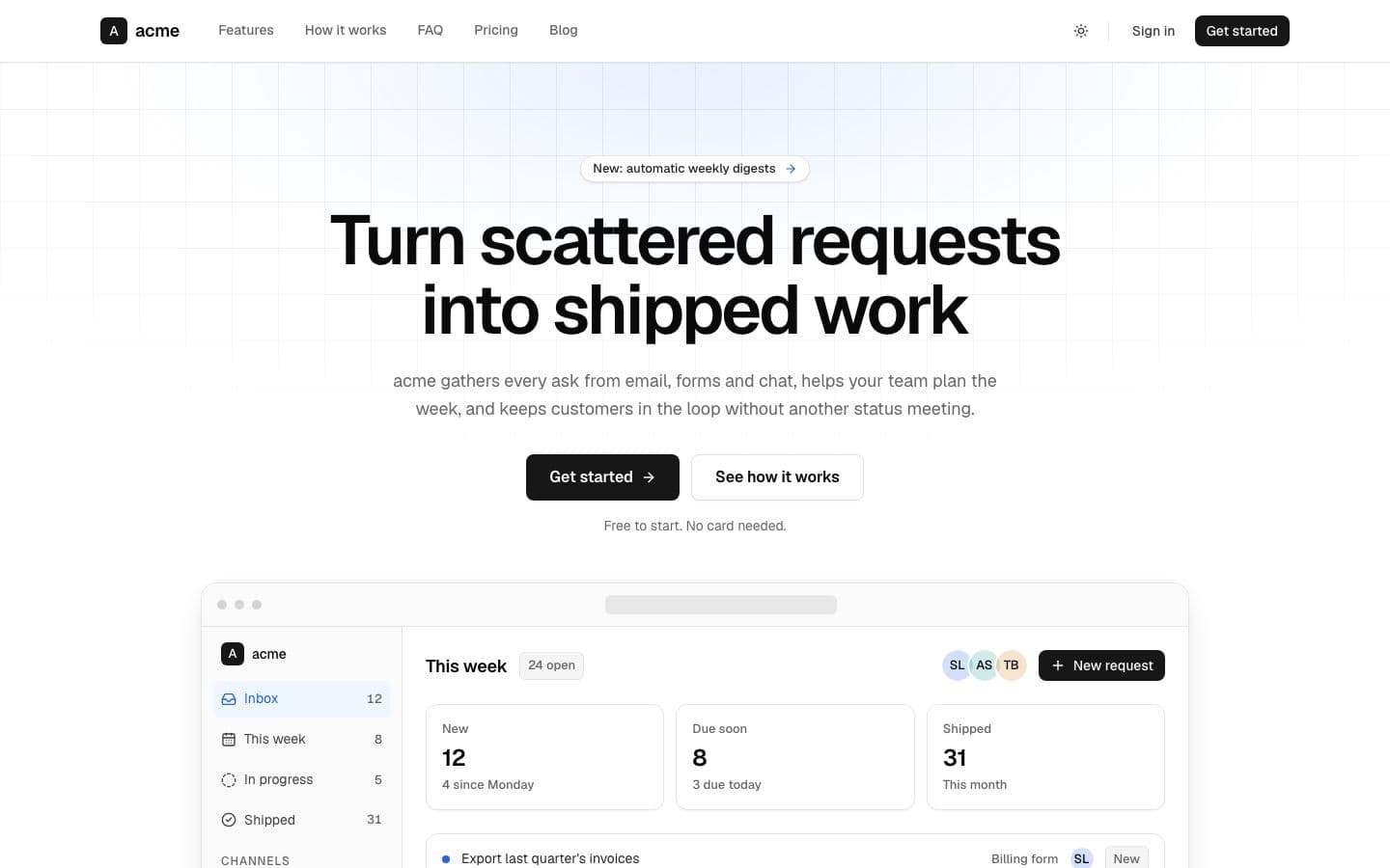
  • Default: the landing page in light

    shadcn done carefully. Neutral greys, near-black actions, one blue for links, Geist throughout.

    Inspired by shadcn/ui

    • Light
    • sans
    • minimal
    Use
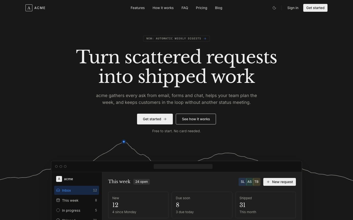
  • Atelier: the landing page in dark

    Bone serif on carbon, a ridge line across the hero and one blue point at its summit.

    Inspired by altitude.so

    • Dark
    • serif
    • editorial
    Use
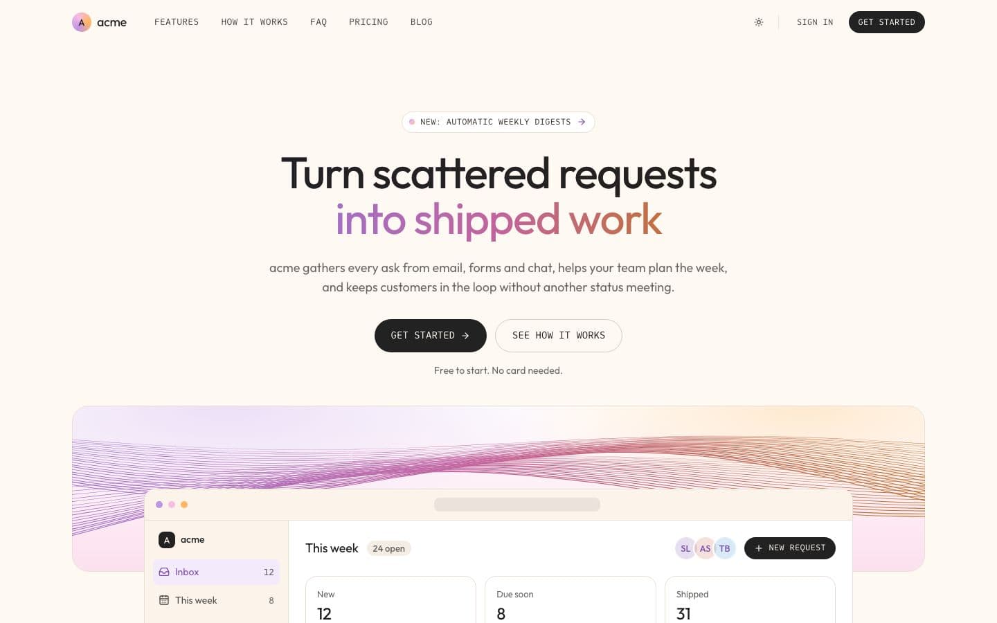
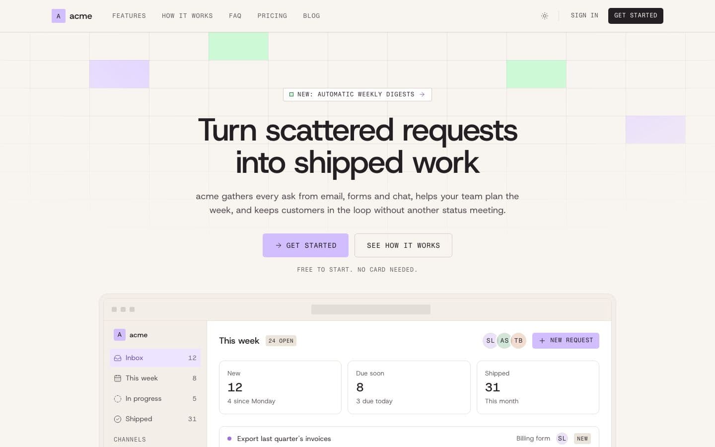
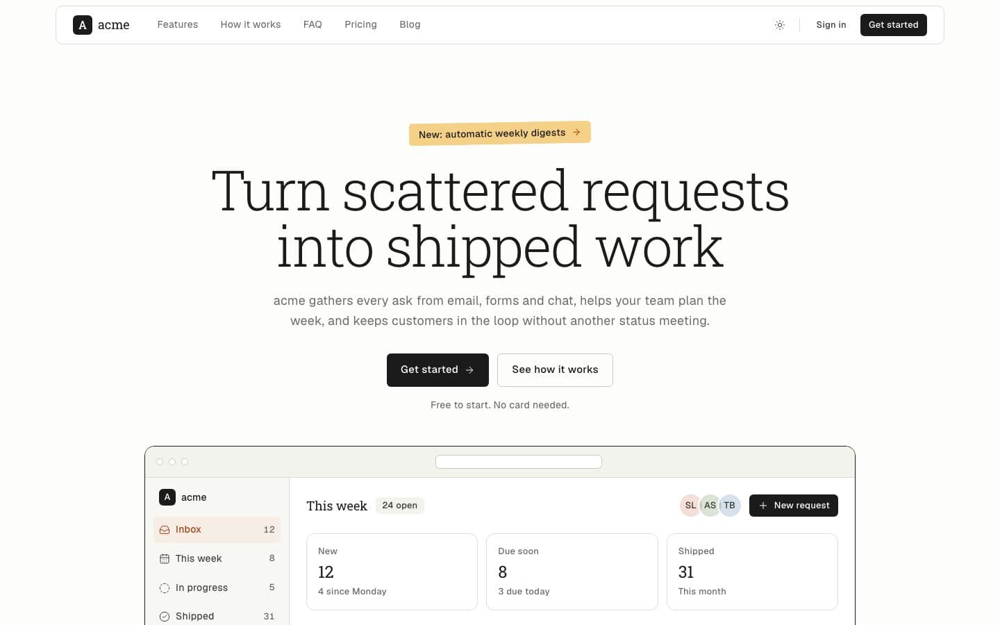
  • Aura: the landing page in light

    Bone paper, ink pills lettered in mono capitals, and a soft violet to amber aura where it counts.

    Inspired by hume.ai

    • Light
    • pill
    • mono
    Use
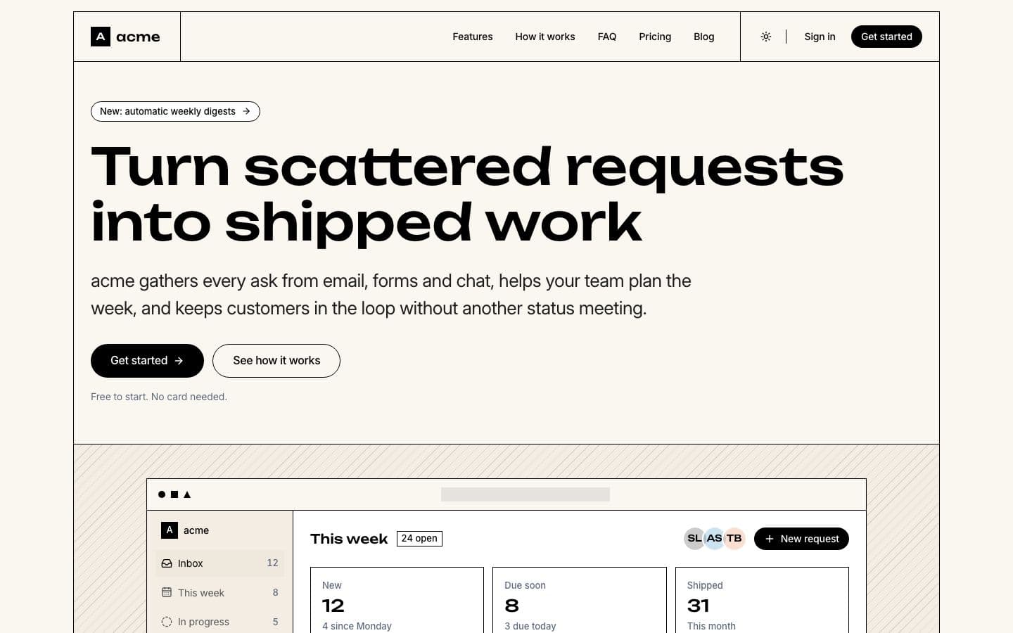
  • Blockhaus: the landing page in light

    Cream paper, black ink, wide geometric headlines. Every section is a ruled block and every action a pill.

    Inspired by helloivy.co

    • Light
    • sans
    • grid
    Use
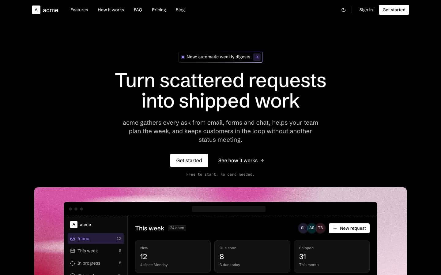
  • Blueprint: the landing page in dark

    Black drafting table, dashed frames, mono labels and one periwinkle pen. Every section reads like a drawing.

    Inspired by index.app

    • Dark
    • sans
    • technical
    Use
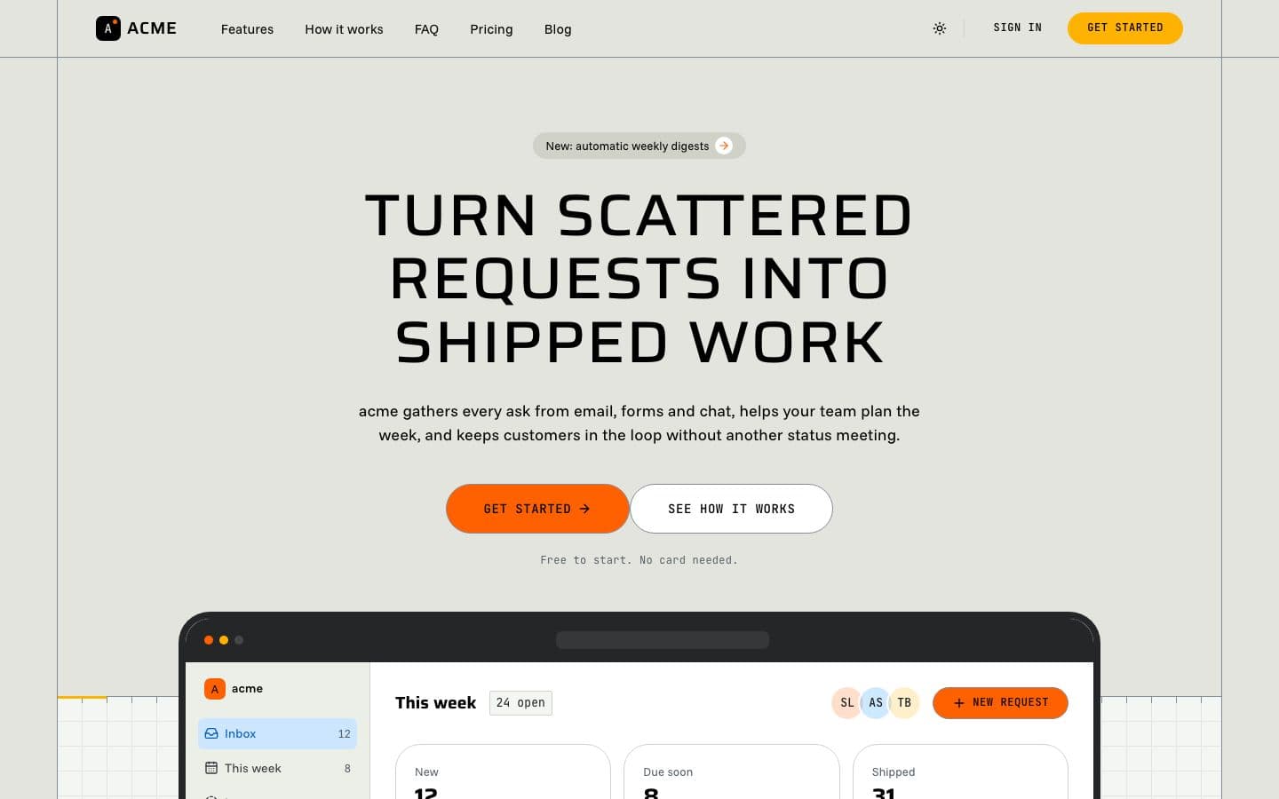
  • Broadcast: the landing page in light

    Sage drafting paper, wide squared headlines, tall orange capsules and dark product screens.

    Inspired by mux.com

    • Light
    • pill
    • flat
    Use
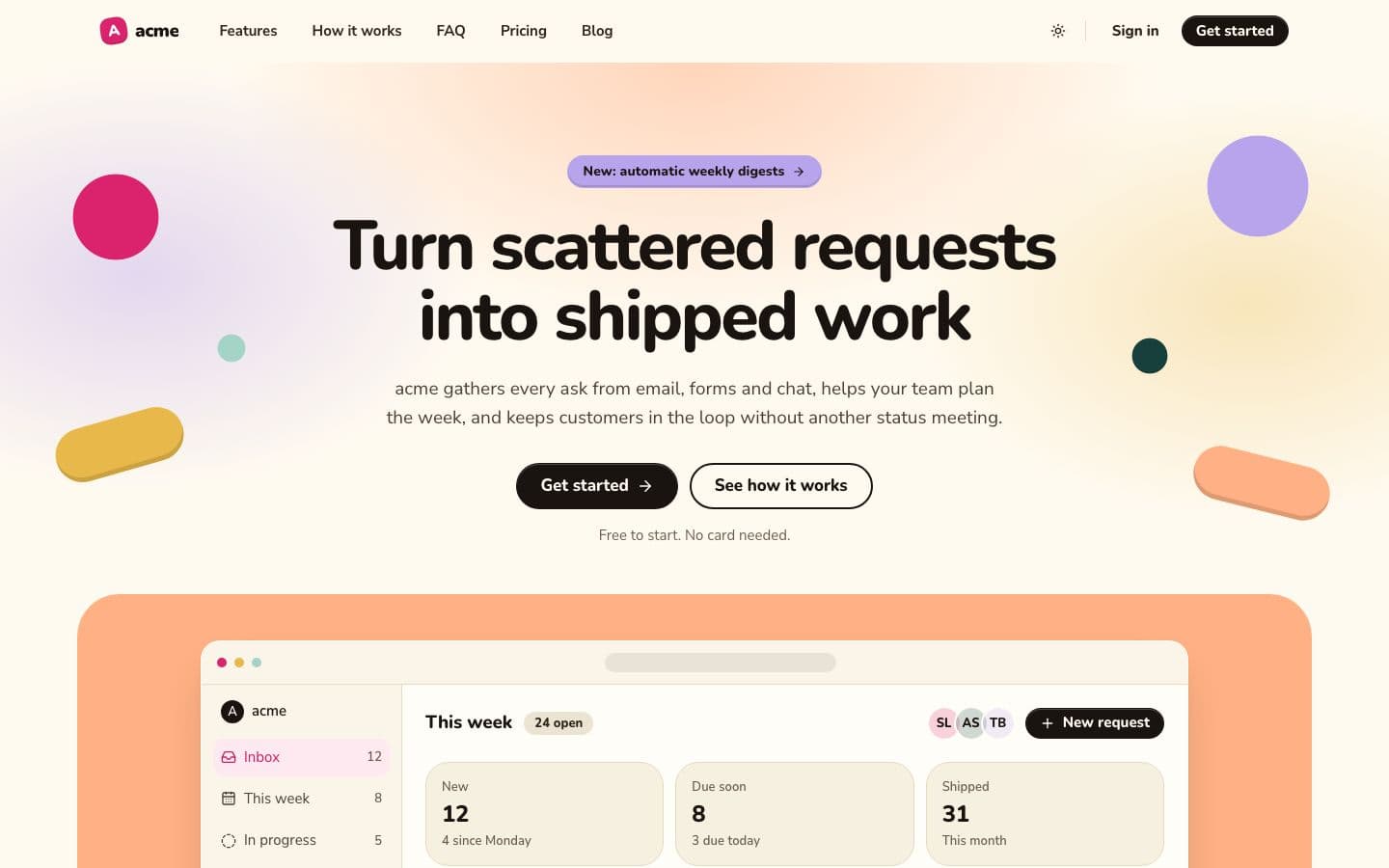
  • Clay: the landing page in light

    Cream canvas, saturated clay tiles, chunky rounded headlines and soft pill buttons. Warm, not grey.

    • Light
    • sans
    • rounded
    Use
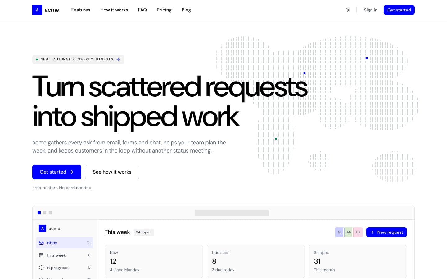
  • Cobalt: the landing page in light

    White canvas, black type and one electric blue. Mono labels, hairline bar maps and no shadows.

    Inspired by base.org

    • Light
    • sans
    • flat
    Use
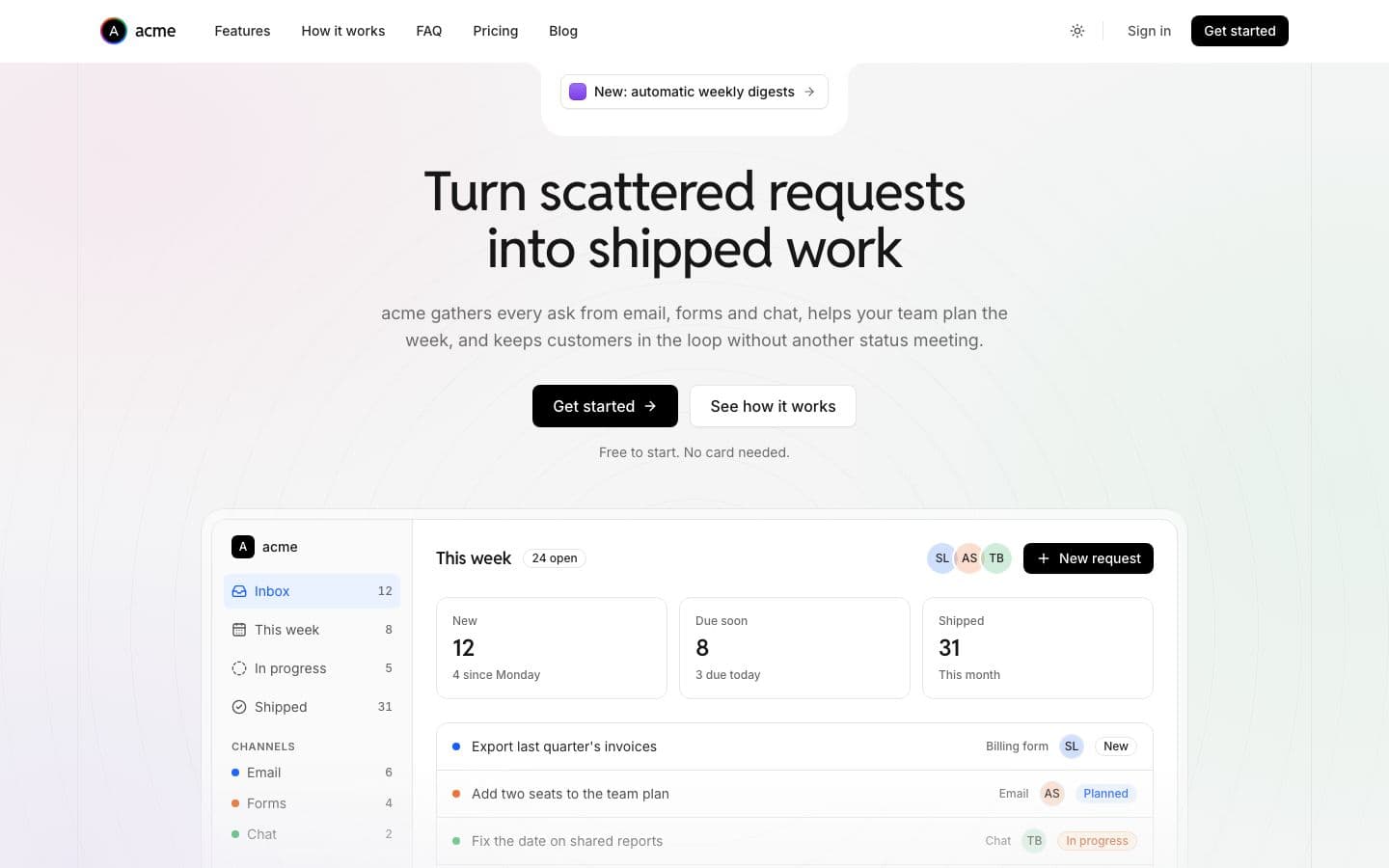
  • Daylight: the landing page in light

    Hairlines, not shadows. Black buttons, one electric blue, and small tags with a pop of pastel.

    Inspired by dub.co

    • Light
    • sans
    • hairline
    Use
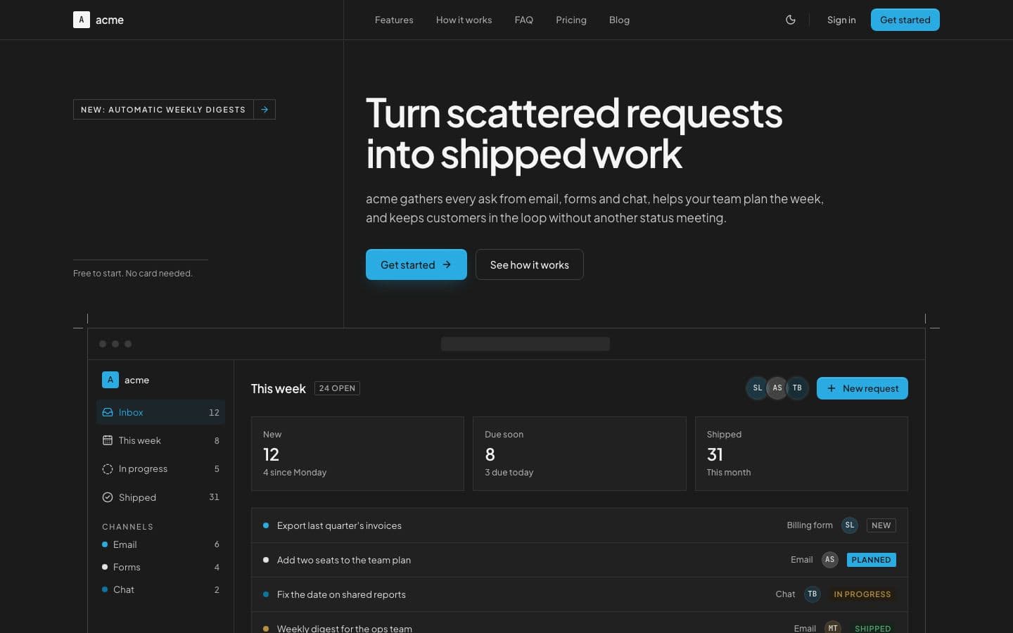
  • Dossier: the landing page in dark

    Pure grey, ruled with hairlines and split down one rail. Square panels, tracked caps labels, one bright cyan.

    Inspired by ryplix.com

    • Dark
    • sans
    • square
    Use
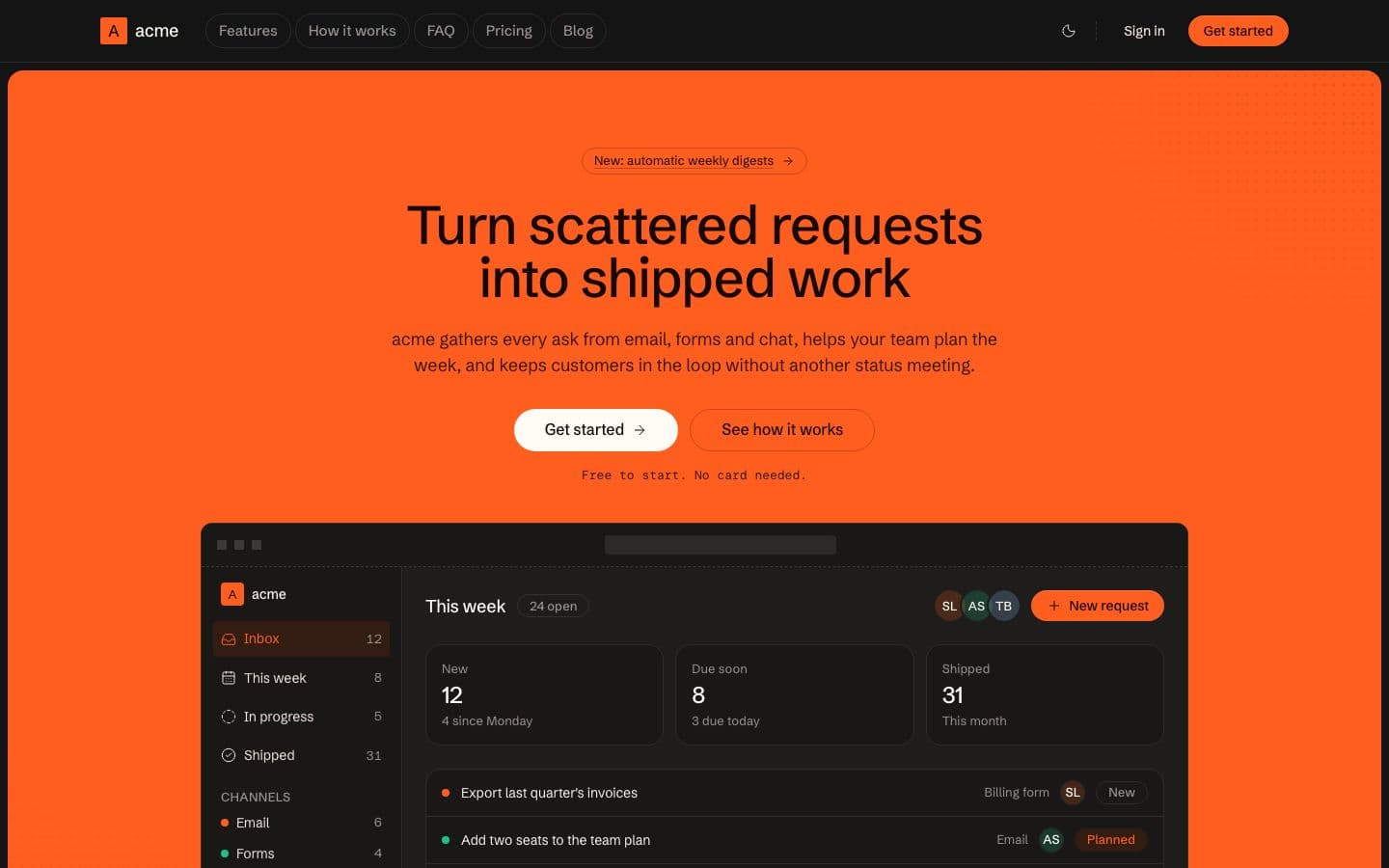
  • Forge: the landing page in dark

    Warm near-black, one loud orange slab, dashed rules pinned with square ticks, and pills for every control.

    Inspired by cloudflare.com

    • Dark
    • warm
    • sans
    Use
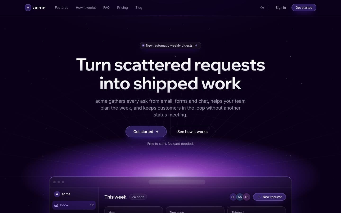
  • Glow: the landing page in dark

    A violet night lit from below: an ultraviolet horizon, glass pill buttons and silver headlines.

    Inspired by wope.com

    • Dark
    • glow
    • gradient
    Use
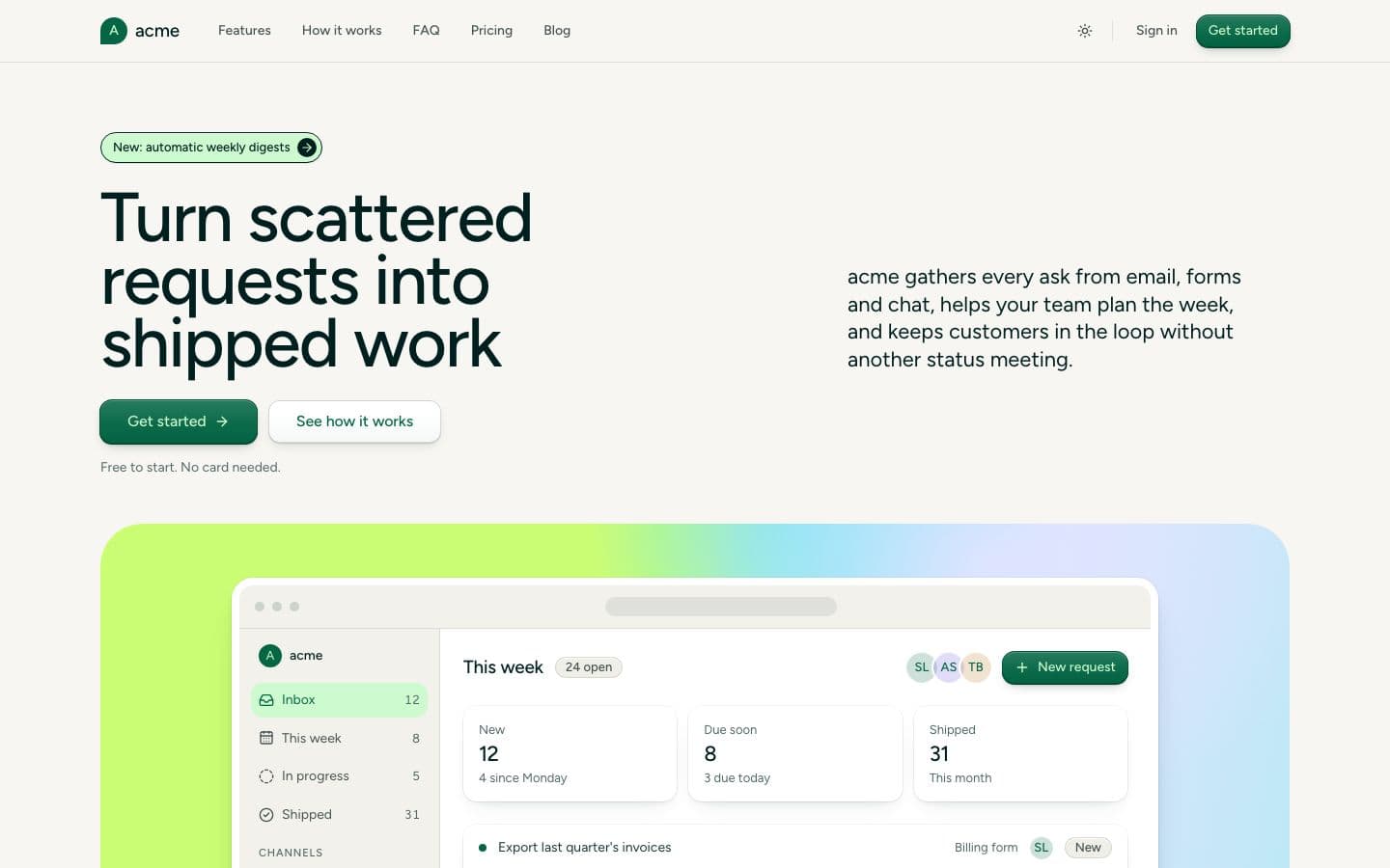
  • Grove: the landing page in light

    Parchment, forest ink and emerald buttons lettered in mint, with a pastel card for every feature.

    Inspired by lattice.com

    • Light
    • sans
    • rounded
    Use
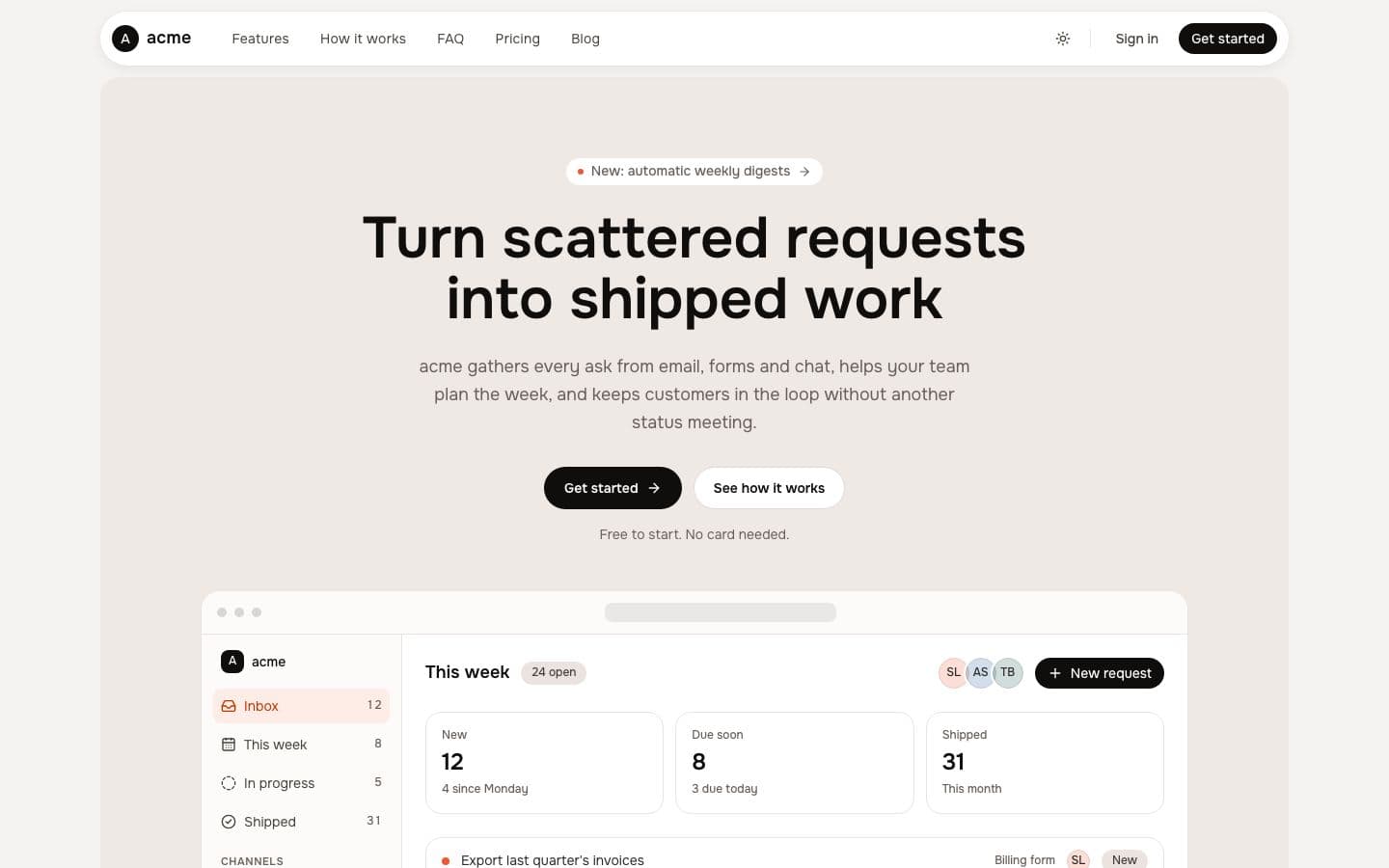
  • Ivory: the landing page in light

    White panels float on warm ivory: a capsule header, black pill buttons and coral kept to small marks.

    Inspired by fish.audio

    • Light
    • sans
    • warm
    Use
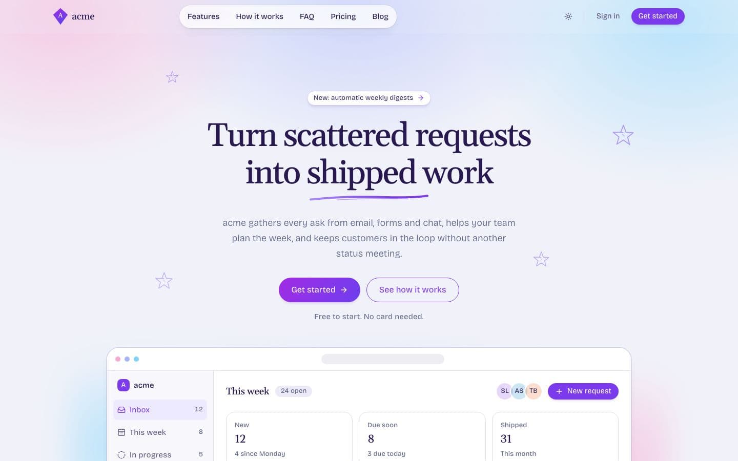
  • Kite: the landing page in light

    A pastel dawn over lavender paper: violet ink serifs, pill buttons and a few sketched stars.

    Inspired by fly.io

    • Light
    • serif
    • pill
    Use
  • Ledger: the landing page in light

    Every edge is a hairline, every corner is square, every headline is a serif. Colour only means status.

    Inspired by midday.ai

    • Light
    • serif
    • square
    Use
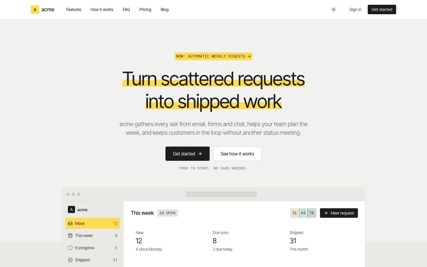
  • Marker: the landing page in light

    Warm paper, light black type and one highlighter yellow that marks what matters.

    Inspired by withsable.com

    • Light
    • sans
    • mono
    Use
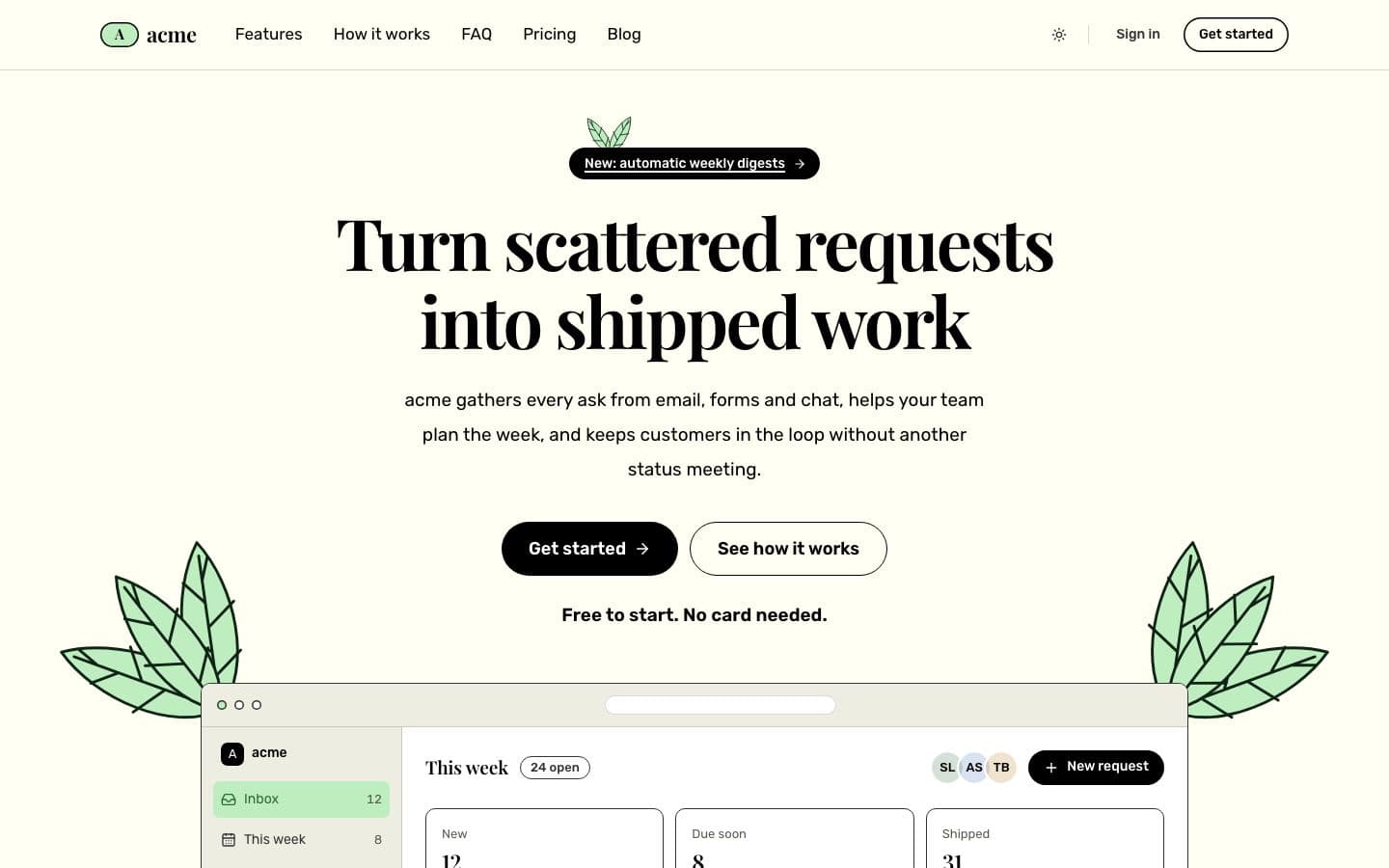
  • Meadow: the landing page in light

    Big serif headlines on sunlit cream, black pill buttons, and sage leaves growing around your product.

    Inspired by evergreen.so

    • Light
    • serif
    • pill
    Use
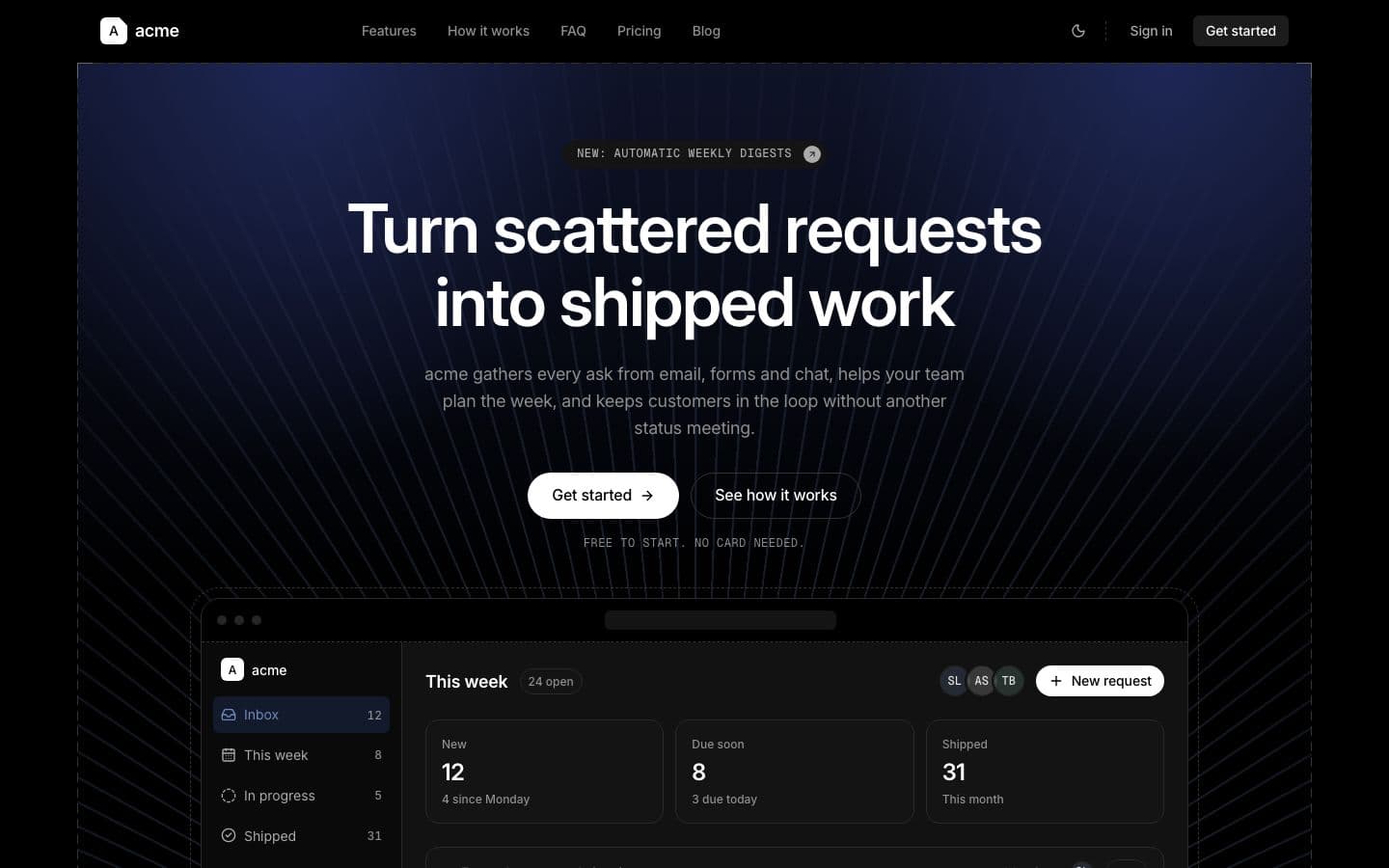
  • Midnight: the landing page in dark

    Pure black, white grotesque type, 1px hairlines, and one magenta cloud behind the product.

    Inspired by liveblocks.io

    • Dark
    • sans
    • hairline
    Use
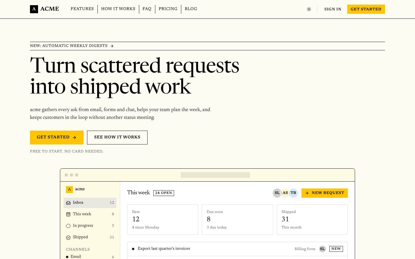
  • Newsprint: the landing page in light

    A quality broadsheet on cream paper. Serif everywhere, black rules, square corners, one yellow button.

    Inspired by monocle.com

    • Light
    • serif
    • editorial
    Use
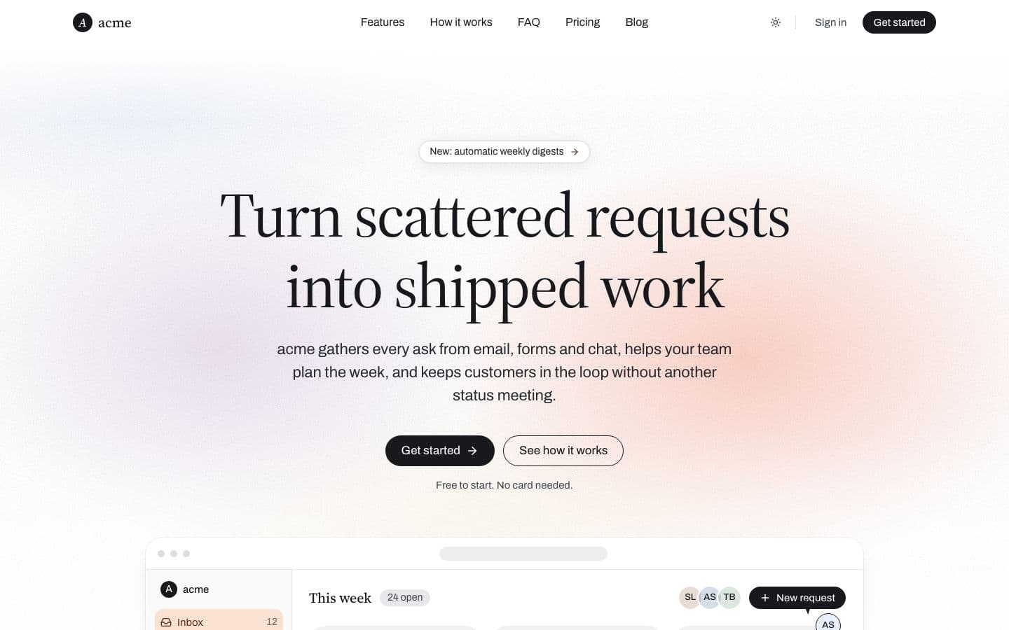
  • Paper: the landing page in light

    Serif headlines on white paper, a grainy peach haze, black pill buttons and product sheets that float.

    Inspired by steep.app

    • Light
    • serif
    • editorial
    Use
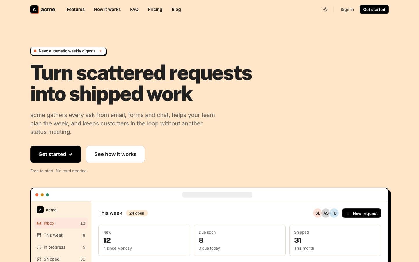
  • Peach: the landing page in light

    Heavy black headlines on peach paper, black buttons, one ember accent and hard block shadows.

    Inspired by coda.io

    • Light
    • sans
    • warm
    Use
  • Plum: the landing page in light

    Cream paper, plum ink, one pale lavender button. Ruled in warm hairlines, labelled in mono caps.

    Inspired by throxy.com

    • Light
    • warm
    • hairline
    Use
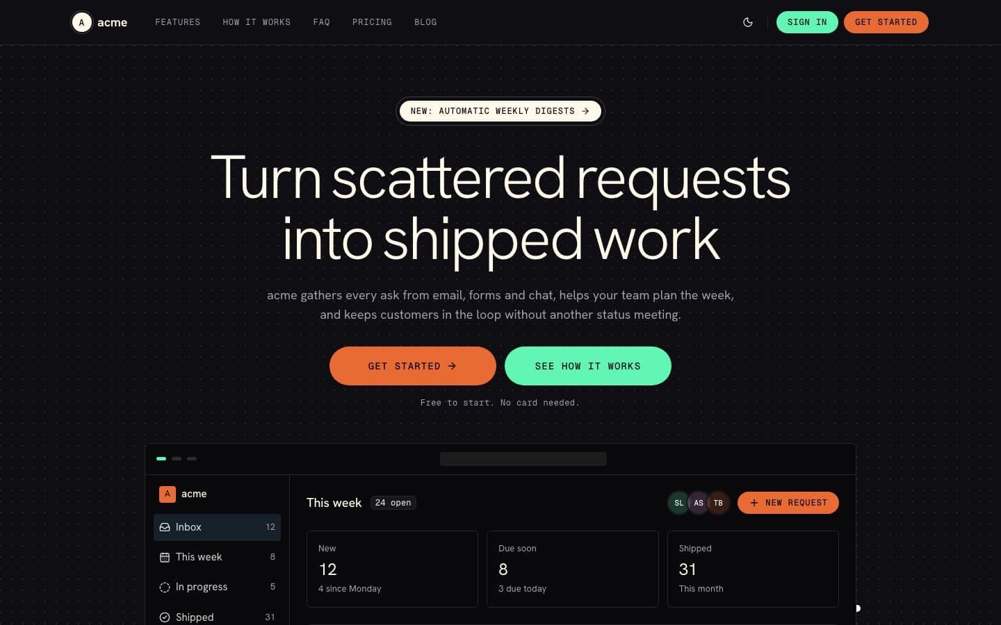
  • Pulse: the landing page in dark

    Cream type on a midnight console, an ember and mint pill pair, and a six hue waveform under the hero.

    Inspired by vapi.ai

    • Dark
    • sans
    • mono
    Use
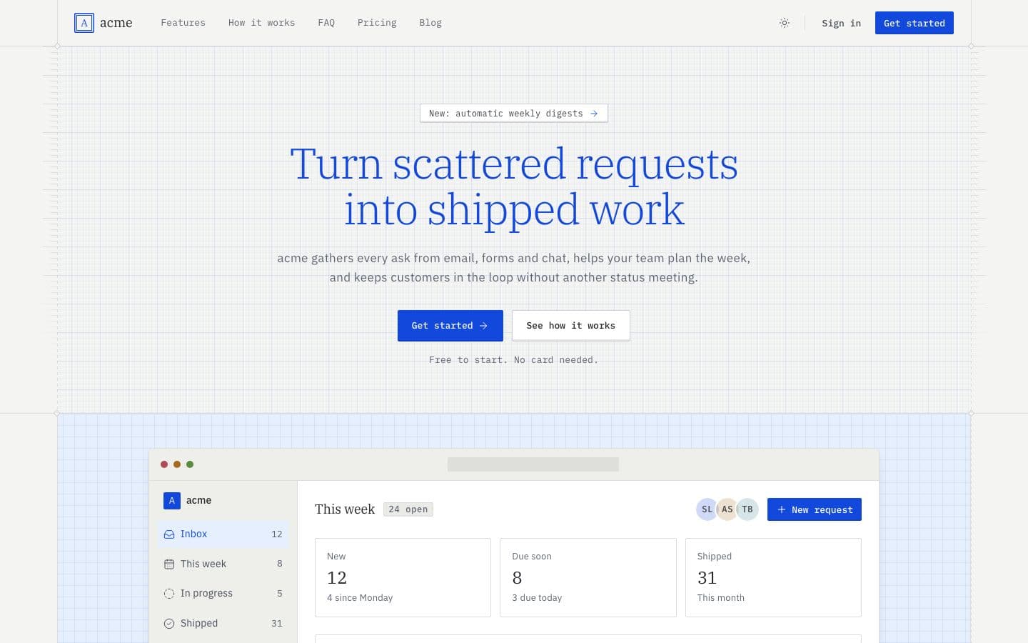
  • Quill: the landing page in light

    A light blue serif, mono keycaps and a drafting frame on warm graph paper. Reads like a technical manual.

    Inspired by zed.dev

    • Light
    • serif
    • mono
    Use
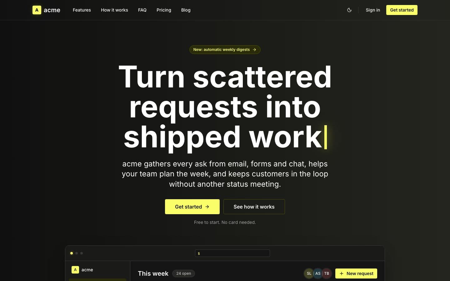
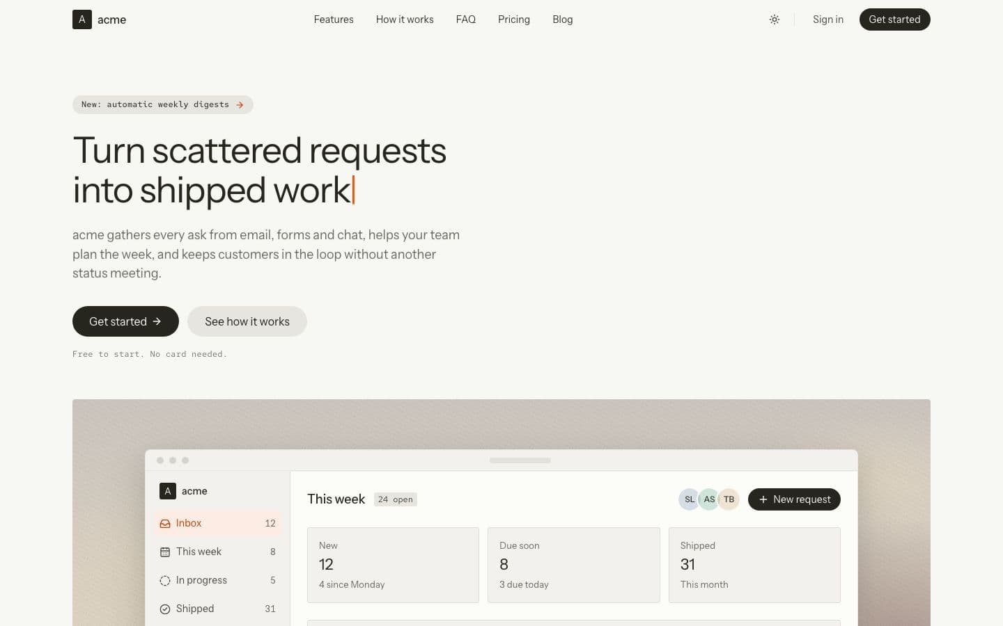
  • Signal: the landing page in dark

    Warm black bands, bold white Inter and one lime button, with a caret blinking after the headline.

    Inspired by clickhouse.com

    • Dark
    • sans
    • technical
    Use
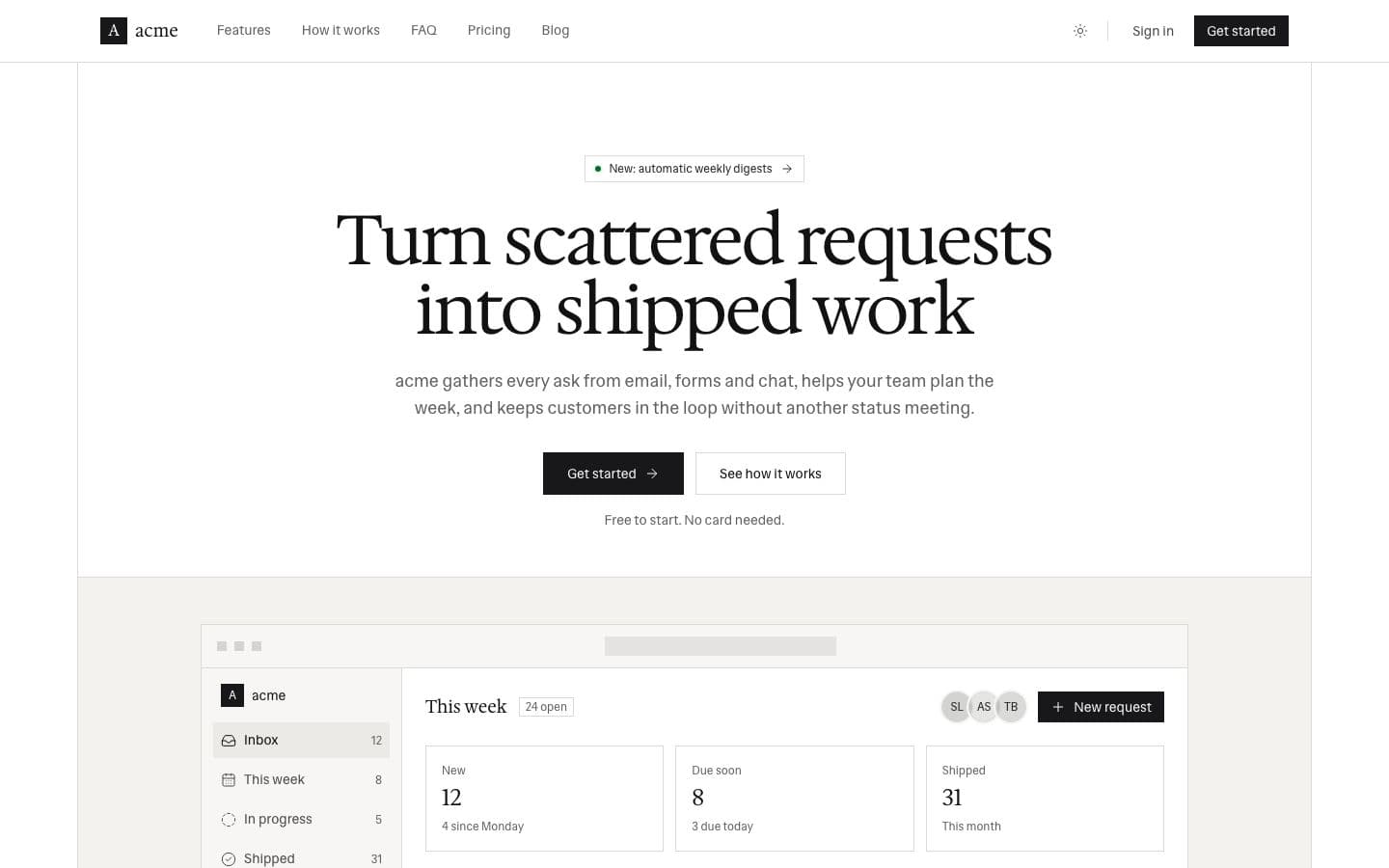
  • Slab: the landing page in light

    Warm paper, black ink and a light slab serif. Hairlines instead of shadows, rust only as text.

    Inspired by town.com

    • Light
    • serif
    • hairline
    Use
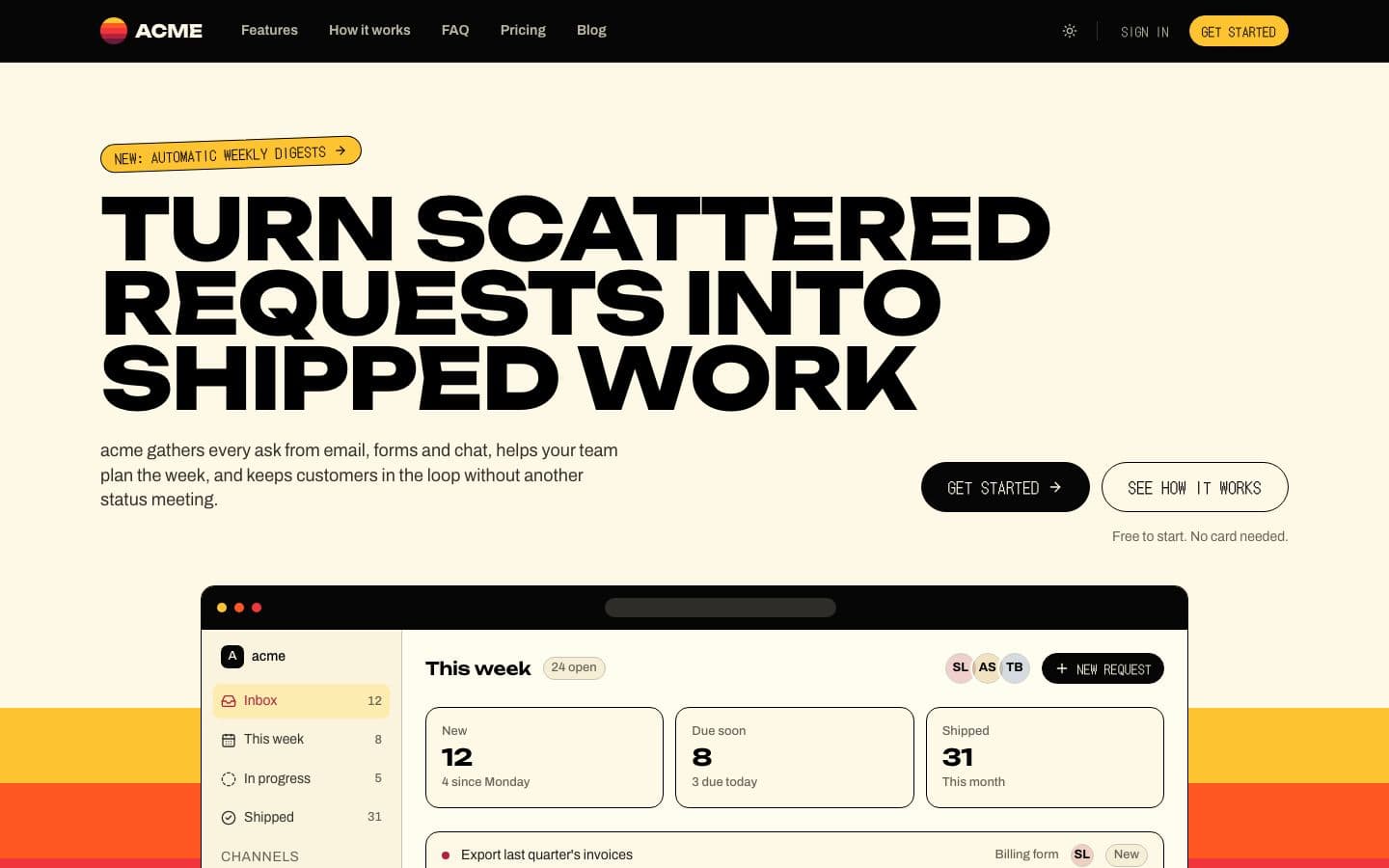
  • Sticker: the landing page in light

    Buttercream pages cut by five sunset stripes, with monumental wide caps and pixel labels on pill buttons.

    Inspired by glyphy.io

    • Light
    • warm
    • flat
    Use
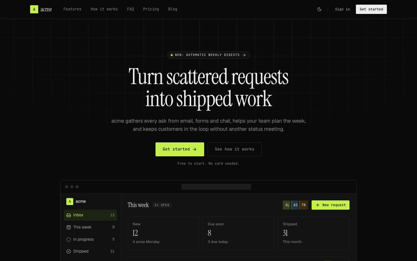
  • Terminal: the landing page in dark

    Serif headlines, mono labels and hairline rules on near-black, with one acid lime for the thing that acts.

    Inspired by theagentic.studio

    • Dark
    • serif
    • mono
    Use
  • Voltage: the landing page in dark

    Pitch black and flat, with violet gradient panels, white pill buttons and a hot magenta spark.

    Inspired by postiz.com

    • Dark
    • sans
    • rounded
    Use
  • Workshop: the landing page in light

    Whisper headlines on warm parchment, ink and linen pill buttons, ember links and a painted stage.

    Inspired by cursor.com

    • Light
    • warm
    • sans
    Use

How the design layer works.

  • Tokens, never raw colour

    Landing page, app shell, admin panel, blog, auth screens, AI chat: every template reads tokens only. The registry lint rejects a raw colour class, so a new design restyles the whole repo.

  • A DESIGN.md the agent reads

    Each design ships a written system, not just variables. The designer agent is the only one allowed to add a visual pattern, and this is what it reads first.

  • Light and dark, contrast checked

    Every design ships both palettes. The app opens in the one it was drawn in and has a theme menu. A test holds both to WCAG AA contrast.

Pick a design in the builder, then build the repo.

Your design is applied to every template before the zip is built. Swapping later means editing tokens, not rewriting components.